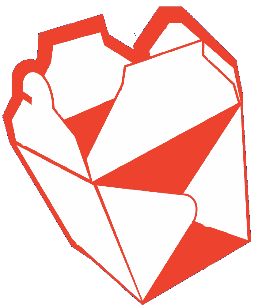
1. I started with a simple stock picture that I could use: a chinese food take out box.
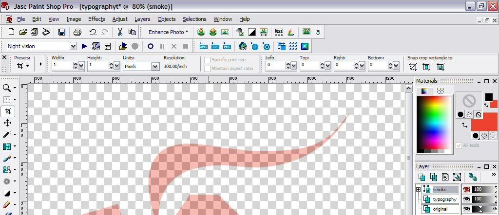
2. I decreased the opacity so that I would be able to position the letters properly. This can be a little tedious. If your program has an option to place text along a line, you can certainly use that, but I just opted for placing everything manually. I created a second layer where I would be positioning the letters. Actually I created several layers: steam, box and shadow, just in case I messed up. click for full view
3. Next, position the letters according to the shape of the stock picture. I used the Bonzai font to match the theme. click for full view
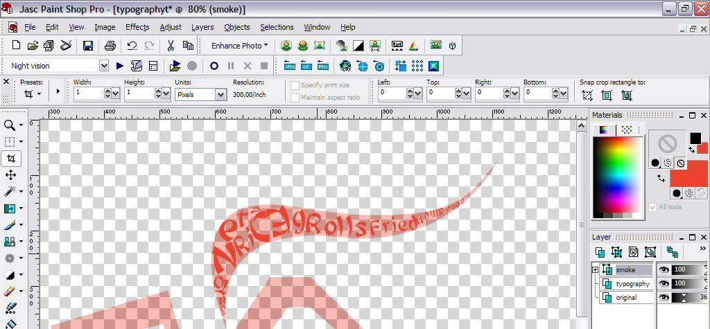
4. Play around with colour, positioning and size until you get the effect you want. click for full view
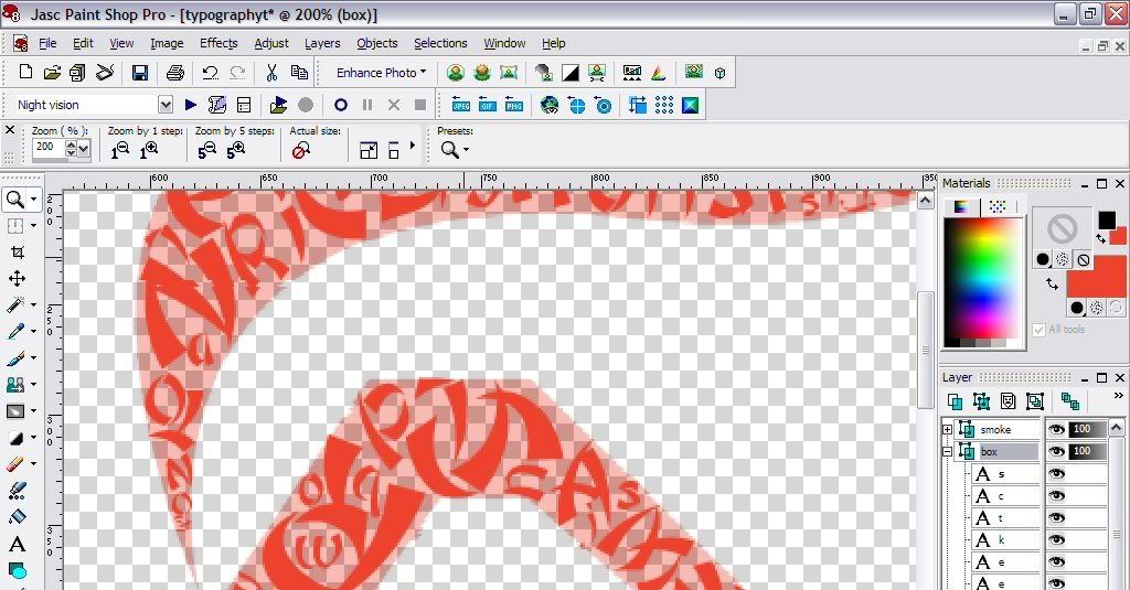
5. Once finished, hide the original layer, change the background colour to black, and voilà your work of art. full view 1290 x 1456
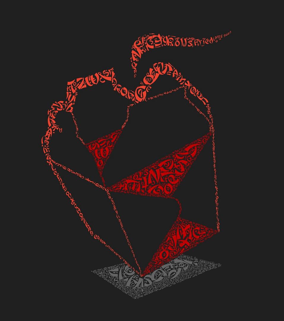
If you find this useful let me know and if you give it a try, send me a picture or link and I will feature your artwork here. I wrote this quick tutorial before I actually undertook the project. Let me tell you that placing all those letters manually takes alot of time and patience but it is very rewarding in the end.
More typograhic art:
Flickr: typography tag search.
Georgeous examples of floral typography.
noupe: 40+ killer typograhic posters, photoshop effects and tutorials.
Speckyboy Design Magazine: 25 examples of amazingly creative typography art.
Six Revisions: 30+ creative typography art. You have got to check this one out!

No comments:
Post a Comment